Help Support Our Growing Community
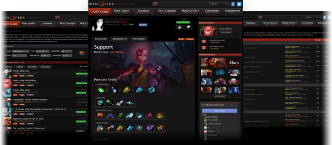
DOTAFire is a community that lives to help every Dota 2 player take their game to the next level by having open access to all our tools and resources. Please consider supporting us by whitelisting us in your ad blocker!

Want to support DOTAFire with an ad-free experience? You can support us ad-free for less than $1 a month!

Go Ad-Free
Smitefire logo

Join the leading DOTA 2 community.
Create and share Hero Guides and Builds.

Create an MFN Account


Or

Polishing Guides

Please review our General Rules & Guidelines before posting or commenting anywhere on DOTAFire.

Forum » Build & Guide Discussion » Polishing Guides 5 posts - page 1 of 1
Permalink | Quote | PM | +Rep by TheSofa » February 1, 2016 7:50am | Report
Hey guys!

There was a recent discussion about what amount of pictures/tables/things other than text is needed in a guide.

Let me offer my two cents, then discuss here.

A guide can be completely comprehensive, offer the best tips out there, etc. etc... but honestly, it might not get a lot of views/likes because people like me don't like looking at walls of text.

A guide can be completely fine without pictures. Pictures make people want to read it though.

Happy discussing,
TheSofa

TheSofa
<Moderator>

Awards Showcase
Show more awards

Memorable (54)
Posts: 3318
Permalink | Quote | PM | +Rep by Janitsu » February 1, 2016 9:31am | Report
I offer my two cents:

Guide without any structure, coding or pictures isn't anywhere near the ones that have one or more of those things.

Example:

TEDtalks is known to have many very entertaining speeches. What are the most entertaining ones? The ones that demonstrate, are structured well and have pictures and charts in order to help with the information. If you don't have pictures or charts, you need to write 1000 words to explain it which most of us don't even honestly care about. A simple picture to explain positioning is easier and simpler than "you should always try to position yourself in between... and also try to avoid... did I remember to say that if... and also..."

Janitsu
<Moderator>

Awards Showcase
Show more awards

Memorable (74)
Posts: 1209
Steam: Cottontail Teemo
View My Blog
Permalink | Quote | PM | +Rep by Sanvitch » February 1, 2016 10:00am | Report
Any piece of writing designed to convey information has to be designed with it's auidience in mind, as well as it's primary aim.

In the case of a guide, it's aim should be to break down large amounts of information into absorb able chunks, convey said information correctly, whilst being appealing enough to make people want to read it in the first place from an initial glance. Since it's expected that people reading these guides aren't say academics, they are going to be average level players with enthusiasm for the game. But hell, even academic text books have basic formating and structure to ease reading.

Nothing will kill enthusiasm like massive blocks of text that's been ill structured and no formatting, it makes reading it a chore. It's not comparable to a piece of fiction, and I would struggle to name a decent piece of non fiction that is just 300 pages of unstructured words that is of any use .

And yes, whilst visuals are't required, they certainty help. They add clarity, they break the text down, and they save you having to describe situations. As well as being pleasant on your eyes.

The actual information in the guide could be fantastic, but if it's not structured and conveyed in an efficient and appropriate manner for the auidience, it's still an awful guide. Great guides have both formatting, and content. Shouldn't be forgotten .

Since you just can't have enough Chaos Breaker.

Sanvitch


Notable (18)
Posts: 1036
View My Blog
Permalink | Quote | PM | +Rep by Cuttleboss » February 1, 2016 10:45am | Report
Most people respond better if there are visuals, and also when paragraphs are divided, it helps with where one thought begins and ends.

I personally structure my guides on Cracked articles, occasional visuals (with captions), lots of headers and sections.

People really like to know when to shift their minds and key visuals help that, it's an important facet to learning, bonus points if you use mnemonic devices. It's a more effective way of teaching more people. If that's the goal, there has to be mass appeal, and guide makers have to play ball.

It's not required for everyone to learn however, some people are okay with just reading, however, text without imagery (whether literal or with vivid language like F. Scott Fitzgerald) is more easily forgotten. It can be a point of contention that good visuals can be used to pass a bad message (terrible Dota builds, the movie Only God Forgives, propaganda), but that's not something to denounce visual based guides for.

Cuttleboss
<Editor>


Remarkable (28)
Posts: 689
Permalink | Quote | PM | +Rep by michimatsch » February 1, 2016 10:49am | Report
Regarding the book argument: Even books are "formatted" they have paragraphs and lines which makes sense in the context; they have pages. So that isn't a real argument.
And I must say that I like and totally appreciate it when someone uses the so-called "eye-candy" but I don't think it is a must because not everybody can use it (that might be due to the fact that I suck at formatting;poor Lion guide).

michimatsch

Awards Showcase
Show more awards

Remarkable (26)
Posts: 775
Steam: michimatsch
View My Blog

Quick Reply

Please log in or sign up to post!

DOTAFire is the place to find the perfect build guide to take your game to the next level. Learn how to play a new hero, or fine tune your favorite DotA hero’s build and strategy.

Copyright © 2019 DOTAFire | All Rights Reserved