Help Support Our Growing Community
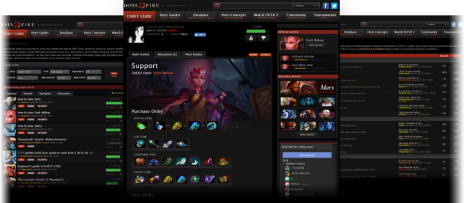
DOTAFire is a community that lives to help every Dota 2 player take their game to the next level by having open access to all our tools and resources. Please consider supporting us by whitelisting us in your ad blocker!

Want to support DOTAFire with an ad-free experience? You can support us ad-free for less than $1 a month!

Go Ad-Free
Smitefire logo

Join the leading DOTA 2 community.
Create and share Hero Guides and Builds.

Create an MFN Account


Or

Update: Shiny New Menu, and More!

Please review our General Rules & Guidelines before posting or commenting anywhere on DOTAFire.

Forum » News » Update: Shiny New Menu, and More! 10 posts - page 1 of 1
Permalink | Quote | PM | +Rep by Matt » March 29, 2012 8:26pm | Report
We just put up an update that includes a number of things :) Here's a breakdown of what's new!

The biggest update by far is that we've done a massive overhaul of the main menu to replace it with a new "mega menu", which allows us to include a lot more useful information :) We hope this will help both new and regular users to navigate the site and maybe even discover some things you didn't know were here!

You can now add your live streams automatically without having to post in the old forum thread and wait! Just hop over to your profile, paste your stream link and go! You will instantly appear in our streams list with no wait! Doing it this way also ties the stream to your profile so that in the future we can promote your stream next to your posts more easily. If your stream is already on DOTAFire, you should still go to your profile and add it there, this will claim it and attach it to your profile.

The heroes database page has been updated to track your filter using a hash on the URL, this means you can link directly to or bookmark a filtered list for convenience. This is used in the new menu to link directly to filtered lists of heroes.

We have added a number of moderator tools in to give Atlas and virago more power to manage and maintain the site! While this only really affects them directly, it does mean that they will be able to help you out much more rapidly when issues come up!

There are a lot of smaller fixes and tweaks in this update but I've lost track of them, these were the important ones :)

So enjoy!! Let us know what you think of the new menu!

Matt
<Administrator>


Remarkable (23)
Posts: 249
View My Blog
Permalink | Quote | PM | +Rep by Atlas » March 29, 2012 8:36pm | Report
Awesome, Matt, thanks!

And the Menu looks fantastic. I assume Flash did it? Either way, it's beautiful.

Atlas
<Retired Admin>

Awards Showcase
Show more awards

Established (117)
Posts: 1683
View My Blog
Permalink | Quote | PM | +Rep by Matt » March 29, 2012 8:40pm | Report
Yup! Flash does all the designs/graphics/layouts :) I agree, it looks great!! I much prefer this style of menu to boring old lists.

Matt
<Administrator>


Remarkable (23)
Posts: 249
View My Blog
Permalink | Quote | PM | +Rep by dresmasher » March 30, 2012 5:57am | Report
sweet stuff !
Even a warped mind can see the odds stacked against it!


dresmasher


Remarkable (24)
Posts: 197
Steam: dresmasher
View My Blog
Permalink | Quote | PM | +Rep by Whated » March 30, 2012 7:06am | Report
Tabs seems to be nice and detailed. Thought you could code them to vanish/appear more smoothly :P ;).
If the day should ever come when we must go, if some day we are compelled to leave the scene of history, we will slam the door so hard that the universe will shake and mankind will stand back in stupefaction.
Joseph Goebbels

Whated


Notable (12)
Posts: 248
Steam: Whated
View My Blog
Permalink | Quote | PM | +Rep by Matt » March 30, 2012 12:23pm | Report
We can very easily add a fade in/out effect to them, if that's what you mean? In fact the code originally did have these effects, we removed them heheh... Our experience with the fade effects is that they often run choppy for a lot of people and the end result is not very pleasing to the eye. In the end we decided that having them appear instantly, after a short delay to prevent accidental opening, was the most convenient for long-term use :)

Matt
<Administrator>


Remarkable (23)
Posts: 249
View My Blog
Permalink | Quote | PM | +Rep by Aedroth » March 30, 2012 12:48pm | Report
Looking nice I like the Play 2 Win tad :D

Aedroth


Posts: 8
Steam: Tyrellbennett
Permalink | Quote | PM | +Rep by Iratesniper » March 30, 2012 5:33pm | Report
It looks smexy, nice job!
I like the little drop down hover, its convenient.

Iratesniper


Notable (5)
Posts: 329
Steam: Iratesniper
Permalink | Quote | PM | +Rep by Leech » March 31, 2012 6:04pm | Report
Very good looking great work guys.

Leech


Remarkable (25)
Posts: 474
Permalink | Quote | PM | +Rep by BoredomIsFun » April 1, 2012 10:50pm | Report
We have added a number of moderator tools in to give Atlas and virago more power to manage and maintain the site!
Yay!

BoredomIsFun


Notable (12)
Posts: 85
Steam: BoredomIsFun
View My Blog

Quick Reply

Please log in or sign up to post!

DOTAFire is the place to find the perfect build guide to take your game to the next level. Learn how to play a new hero, or fine tune your favorite DotA hero’s build and strategy.

Copyright © 2019 DOTAFire | All Rights Reserved